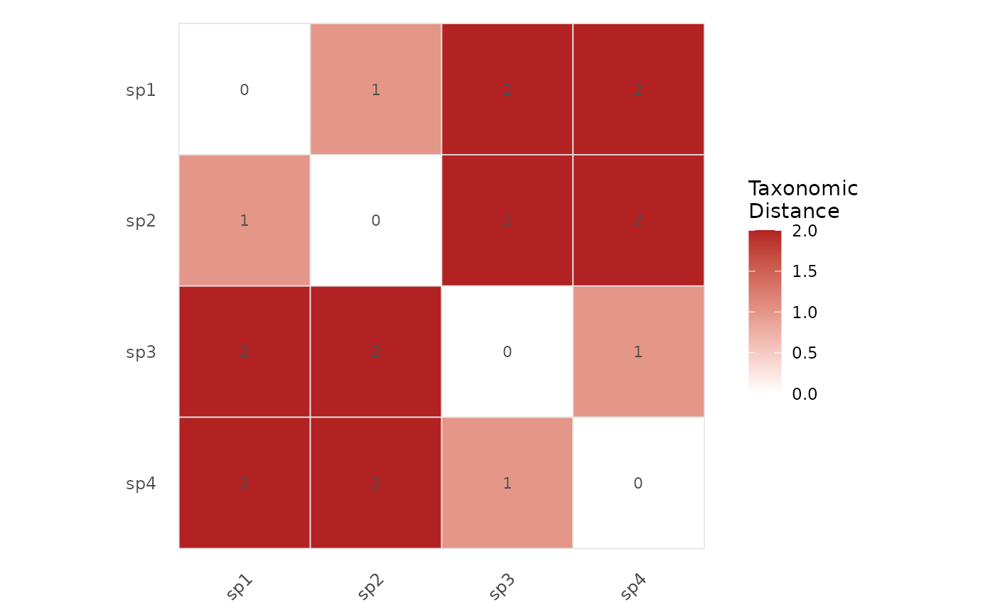
Visualizes the pairwise taxonomic distance matrix as a colored heatmap using ggplot2. Species are ordered by hierarchical clustering so that taxonomically similar species appear adjacent.
Usage
plot_heatmap(
  tax_tree,
  label_size = 3,
  title = NULL,
  low_color = "white",
  high_color = "#B22222"
)
Arguments
- tax_tree
A data frame representing the taxonomic hierarchy, as produced by
build_tax_tree.- label_size
Numeric value controlling the size of species labels. Default is 3.
- title
Optional character string for the plot title.
- low_color
Color for the lowest distance (most similar). Default is
"white".- high_color
Color for the highest distance (most distant). Default is
"#B22222"(firebrick red).
Details
The heatmap displays the full symmetric distance matrix computed by
tax_distance_matrix. The diagonal (self-distance = 0)
appears in the lowest color. Species are reordered using hierarchical
clustering (UPGMA) to reveal taxonomic groupings visually.
Examples
# \donttest{
tax <- build_tax_tree(
  species = c("sp1", "sp2", "sp3", "sp4"),
  Genus   = c("G1", "G1", "G2", "G2"),
  Family  = c("F1", "F1", "F1", "F2")
)
plot_heatmap(tax)

# }
# }