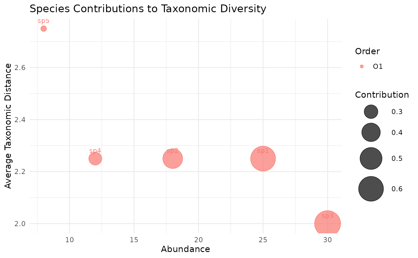
Creates a bubble chart showing each species' abundance (x-axis), average taxonomic distance to other species (y-axis), and relative contribution to the community (bubble size). Species that are both abundant and taxonomically distant from others contribute most to overall taxonomic diversity.
Arguments
- community
Named numeric vector of species abundances.
- tax_tree
A data frame representing the taxonomic hierarchy, as produced by
build_tax_tree.- color_by
Character string specifying which taxonomic rank to use for coloring bubbles. Must match a column name in
tax_tree. IfNULL(default), the highest available rank is used.- title
Optional character string for the plot title.
Details
For each species \(i\), the average taxonomic distance is calculated as:
$$\bar{\omega}_i = \frac{1}{S-1} \sum_{j \neq i} \omega_{ij}$$
where \(\omega_{ij}\) is the pairwise taxonomic distance and \(S\) is the number of species. Bubble size represents the product of relative abundance and average distance, indicating each species' contribution to overall taxonomic diversity.